Risks of a Safe Brand Identity by Aidan Beasly
Have you ever found yourself scrolling through some sort of social channel, and every now and then, you get an advertisement? Just something promoting like a chain restaurant or a fashion brand? Normally, if I were to see something like that, I’d look at it briefly and then continue scrolling through. No big deal. But to those advertisers, this is a tremendous deal. They just lost a prospective customer because I wasn’t interested enough. Why would someone like you or me scroll through these ads? I’m not sure about you, but I think I have an answer to this question: the ad simply wasn’t interesting enough to hold my attention. Okay, why was it not enough to keep my interest? It seems brands are no longer willing to take huge swings to promote themselves like they used to. They all seem to play it safe, which inevitably leads to their brand images becoming more bland.
Why Businesses Like to Play it Safe
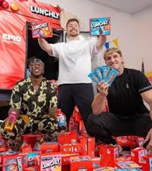
The three people behind the Lunchly Company
So it seems like the best thing to do for your brand is to play it safe, right? Well… I wouldn’t be too keen on that. There has been a trend of various established brands going for a minimalist approach, stripping their identity down to the bare essentials. It is supposed to bring a timelessness to the brand’s image. So why is it that these less flashy voices bring along controversy? Often, these attempts at stripping things down make consumers feel like the brand is losing its “soul.”
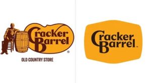
Cracker Barrel’s old logo on the left and the new logo on the right
A Brand that Nailed Being Bold
While risks can be scary, given that it means there’s a high possibility of failure, sometimes it’s necessary to be bold to stand out. Liquid Death knew this. Entering an industry as generic as packaged drinking water, where people know exactly what to expect from the product, means the branding matters tenfold. Liquid Death came up with something very unorthodox for drinking water. For starters, the company adopted an edgy, heavy-metal brand image, which contrasts greatly with the boring product of drinking water. They also opted to package their water in tall aluminum cans instead of plastic bottles. Not only did this position Liquid Death as a more environmentally friendly brand through aluminum’s easier recyclability, but it also reinforced the company’s more edgy image as the design of the cans resembled “tallboy” beer cans. Liquid Death was aware of this as they would release ads showing inappropriate demographics consuming this apparent can of beer (pregnant women, children) before reassuring audiences that they were just drinking water. Most people would think that this would result in a costly controversy, but Liquid Death’s full embrace of edge and irreverent advertising has paid off immensely. The company reached a peak valuation of $1.4 Billion in 2024.
Take that Calculated Risk for Your Brand
While taking uncalculated risks can certainly cause harm, an ultra-safe approach to branding can lead to forgettability or even backlash over an uninspired image. It is crucial for brands to understand who they are and show personality. At Get Fish Slapped, we help brands break away from the mold and create marketing that truly engages audiences. We help others make an impression that lasts.